
Cracking the Curve: Understanding Distributions
Mean, median, max, & min — terms for summary statistics you've likely heard since 3rd grade math. But you may not realize that these are just ways to express distributions of data as a single number.

READ TIME: ∼4 MINUTES | WORDS: 679 Let’s start with the obvious question: what's a distribution?
Following our insight into summary statistics, we can define distribution as "how the data is spread out across all possible values."
Revealing:
Shape (the 'curve')
Clusters (central tendency: mean, median)
Spread (dispersion: standard deviation, range).
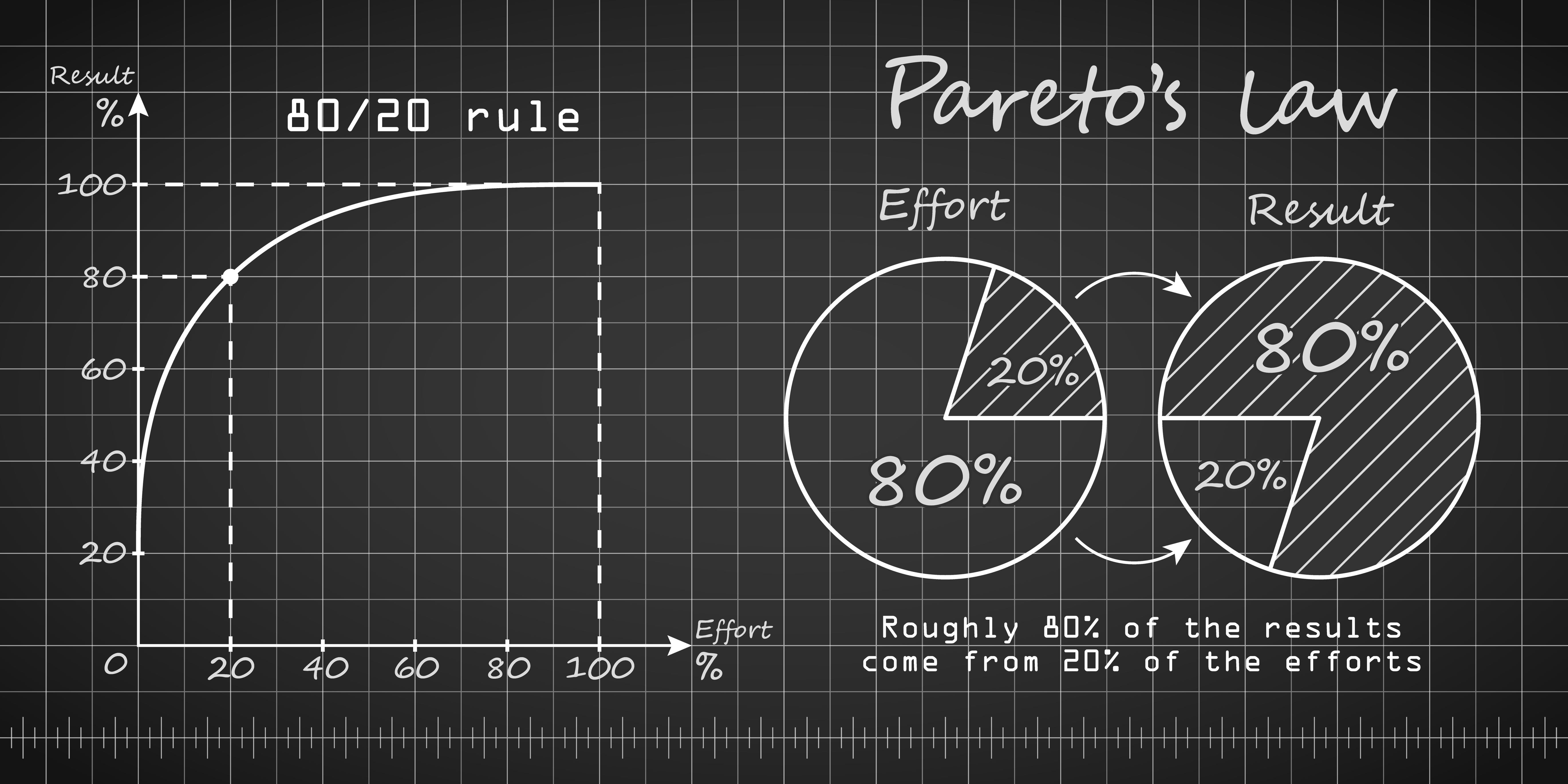
➞ The 80/20 Rule
A commonly known distribution is Pareto's Law/Distribution, widely considered one of life's power laws.
It states that 80% of outputs come from 20% of inputs for many relationships, and you see it across all walks of life:
Wealth: 80% of the wealth is held by 20% of the population.
Nature: 80% of a garden's yield comes from 20% of planted seeds.
Productivity: 80% of results come from 20% of the effort.
Now that we have a firm grasp of distributions, the next logical step, if you're thinking along, is to decide when to use…
➞ Central Tendency Statistics vs. Dispersion Statistics
The reductive quality of summary statistics makes this a crucial consideration for two main reasons:
You're vulnerable to picking the wrong statistic to understand the data best.
You can easily miss significant differences between the groups in your data.
That's why it's a great idea to visualize the distribution of your data before committing to any one summary statistic.
How to best visualize a distribution depends on the type of variable you're concerned with, often requiring you to transform variables.
WHY IT MATTERS
Your variables can be categorical or numerical.
Categorical: Variables that can have only one of a small set of possible values (e.g., baseball players' batting order can only be 1-9) and are commonly visualized using a bar chart.
Numerical: Variables that can have a wide range of values (e.g., the number of home runs a batter hits in a season) and are commonly visualized using a histogram or density plot.
Though the specifics of creating the visualizations mentioned are beyond the scope of this article, we will touch on transforming variables so they can be appropriately plotted.
➞ The Transformers
Factor: Turn values with a fixed set of possible values that can be placed into a 'natural' order into ordered factors with distinct ranks/levels/tiers.
Returning to our batting order example, the four-hitter can only return the value of 4 for his position in the lineup without first needing to hit 1-3; always comes before the five-hitter; always follows the three-hitter.
Therefore, it makes sense to transform baseball players' batting order values into defined ordered factors.
Log(arithm): Compress wide-ranging data that is heavily skewed in one direction and/or exemplifies exponential growth to make the data more linear and easier to visualize and interpret.
Player salaries make a strong case for log transformation because they often follow a heavily right-skewed pattern (superstar contracts that lie far above the majority).
The log tames outlier salaries and clarifies the relationship between players and their pay.
Trimming: Remove or adjust extreme outliers distorting the distribution pattern.
The relationship between strikeouts and earned run average (ERA) for baseball's starting pitchers is a perfect example of the benefit of trimming.
The visualizations below show that merely trimming the years removed extreme outliers in strikeout and ERA that likely came from previous baseball eras.
Creating a more linear and predictable relationship between a modern-day starting pitcher's annual strikeout totals and ERA.
MLB Starting Pitcher's Strikeout by ERA (2000+)

MLB Starting Pitcher's Strikeout by ERA (2000+)

These are just a few transformation techniques that help you spot hidden insights, guide more decisive decisions, and communicate your findings with clarity.
THE BIG PICTURE
Distributions' real power lies in their ability to allow you to spot outliers, detect patterns, and uncover deeper insights.
But this is only possible if you use proper summary and transformation strategies to sharpen your focus, enable more precise understanding, and, most importantly, effectively share actionable takeaways.
For, once again, communication is the ultimate frontier in baseball analytics.
